ActOn HR

Kivikoda

Kivikoda: Brändi visuaalne identiteet ja logo kujundus

Kivikoda wanted to refresh its brand, so I initiated an update that included creating a new logo. Along with the visual identity renewal, a new typeface and suitable color palette were selected to support the company’s unique character.

At the beginning of the process, I created two mood boards for the client, presenting various visual ideas – from typography and color schemes to design elements. For each choice, I included explanations and justifications: why this particular solution was suitable and what meaning it conveyed.

The client selected the mood board that resonated most and best matched the company’s essence and style. Based on this, I continued with a competitor analysis and a brief market study to ensure the brand’s relevance and distinctiveness in the market.

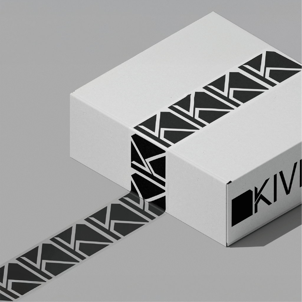
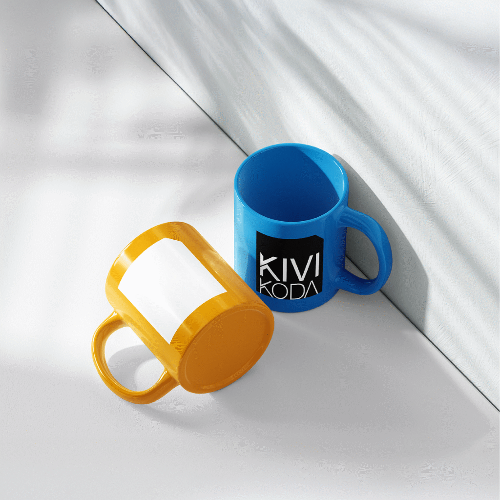
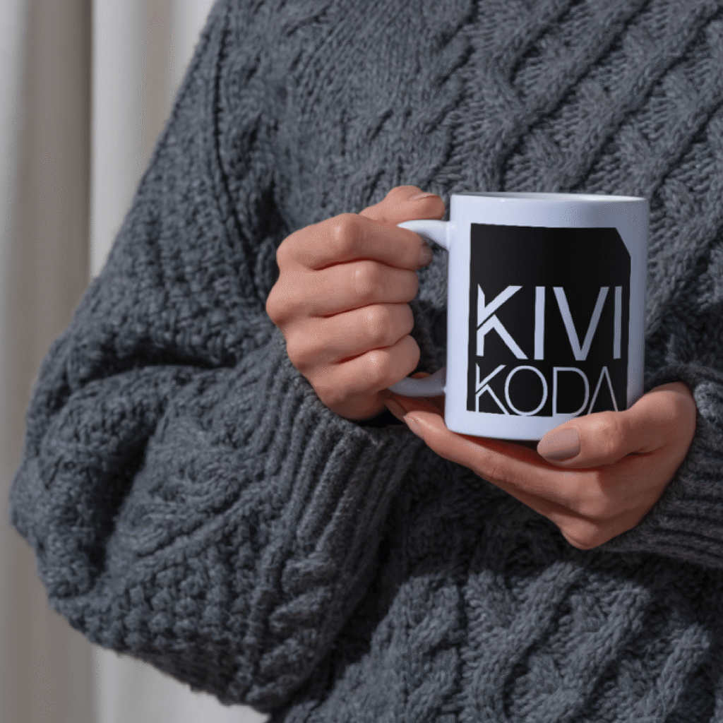
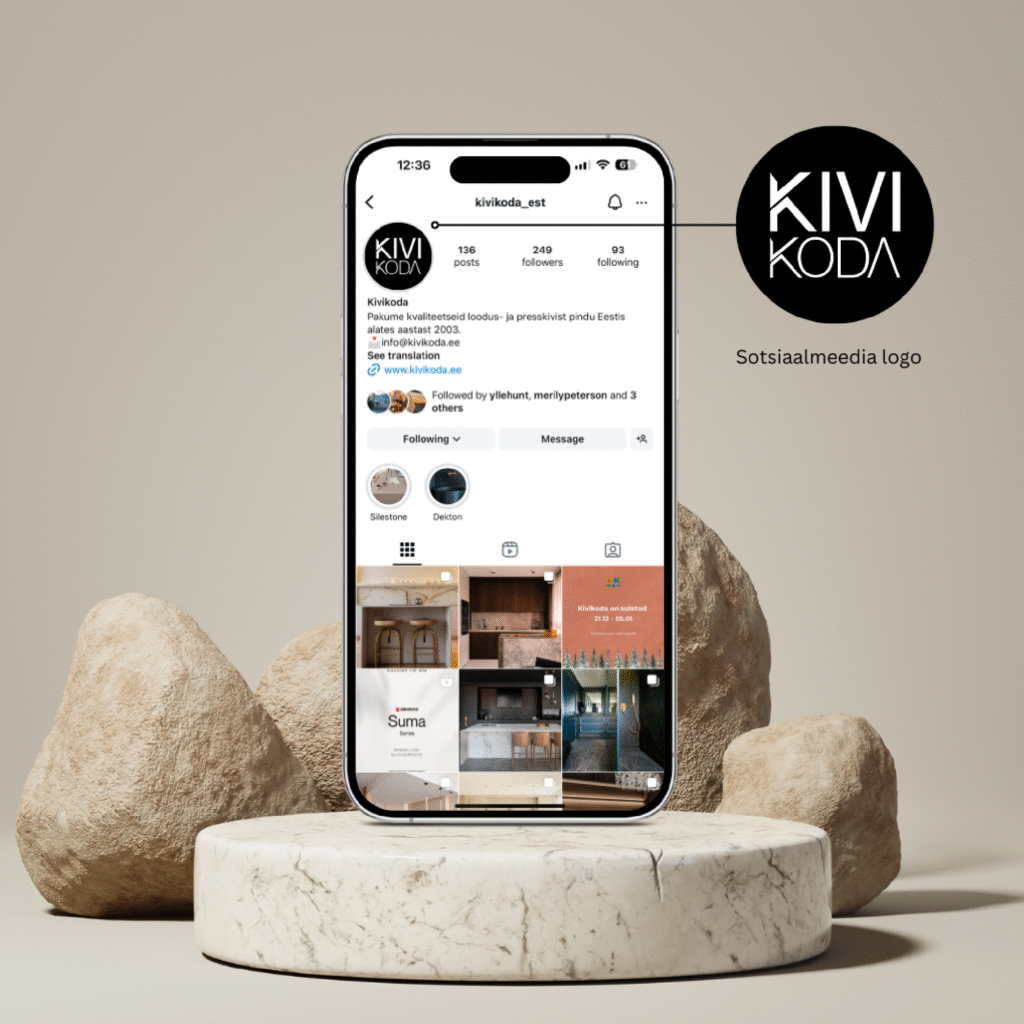
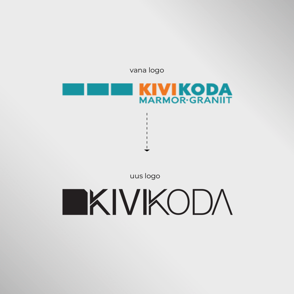
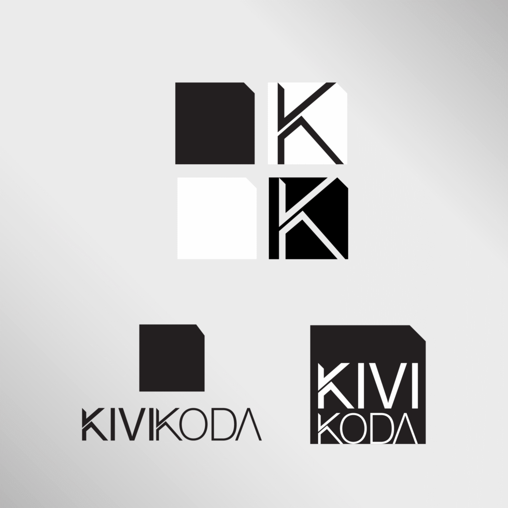
Instead of the old logo with three separate blocks, I designed a single square-shaped symbol with a cut edge, symbolizing the cutting of marble – a direct reference to the company’s core activity. I aimed for a logo that is simple and minimalist, yet full of character. The cutting concept was also incorporated into the design of the letter “K,” emphasizing attention to detail.

For the brand, I selected a typeface that conveys clarity and clean lines, along with colors that reflect Kivikoda’s professional and modern character. I compiled all the work into a brand book, which includes the company’s story, guidelines for using the primary and secondary logos, the color palette, typography choices, logo usage examples, and distinctive visual elements that can (but don’t have to) be used in future designs.
Pille Hunt designs

For the Port Artur retail company, I designed visually engaging social media posts, as well as print materials and posters in various formats, as part of the Back-to-School and Lotte Family Day campaign.

LaPortu

LaPortu: Brand visual identity design

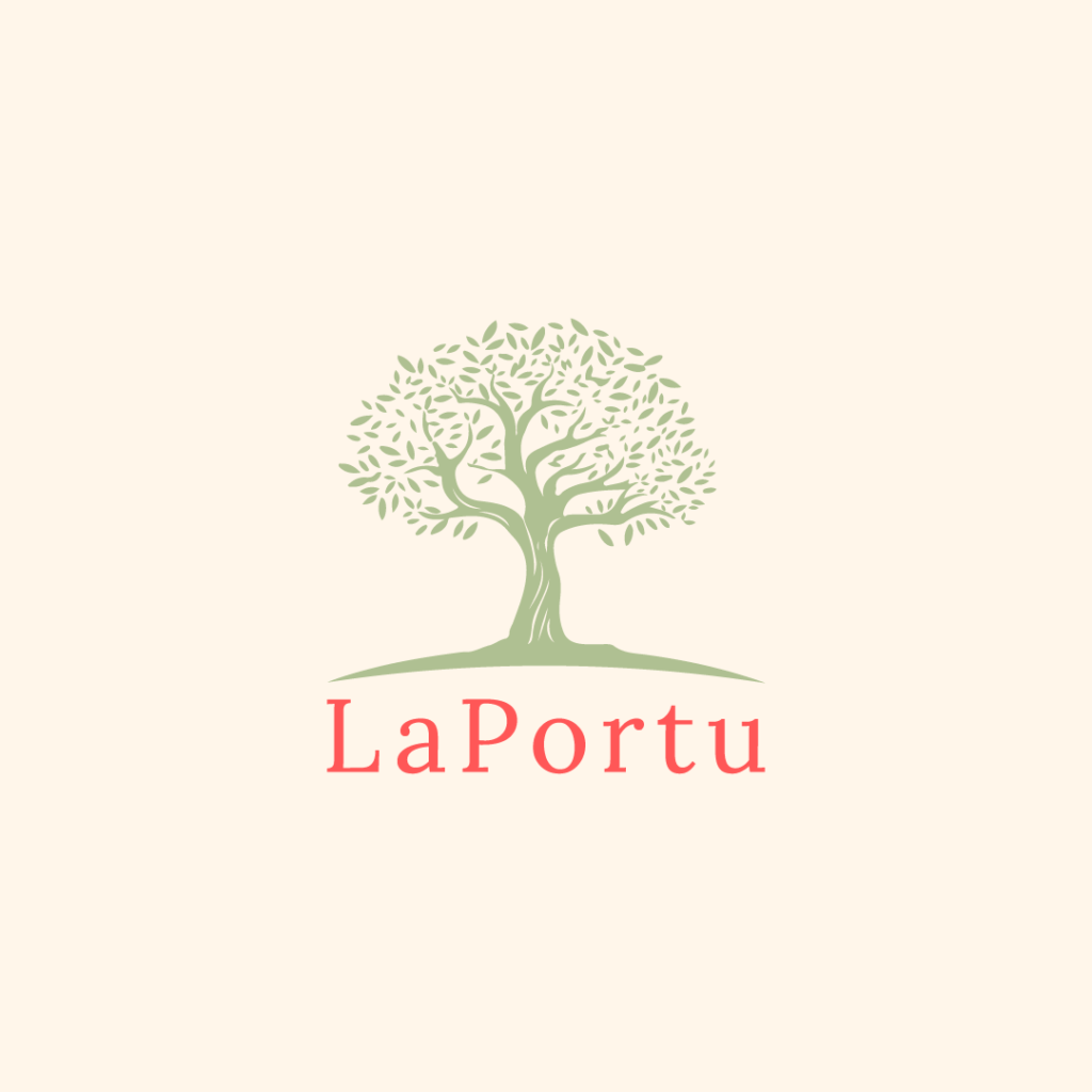
Laportu is a small company that imports exciting Portuguese products, including cooking oils, wines, ceramics, and more.
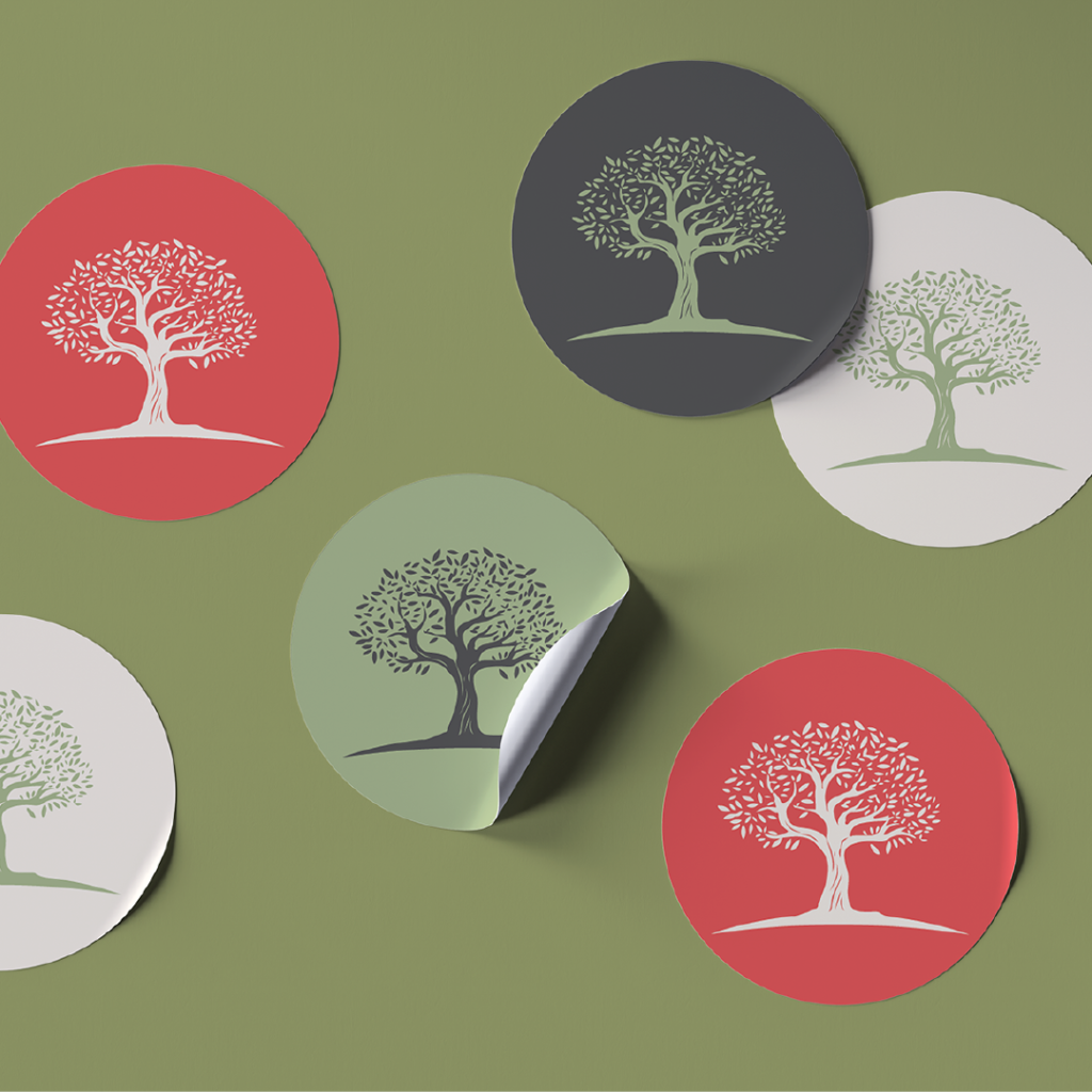
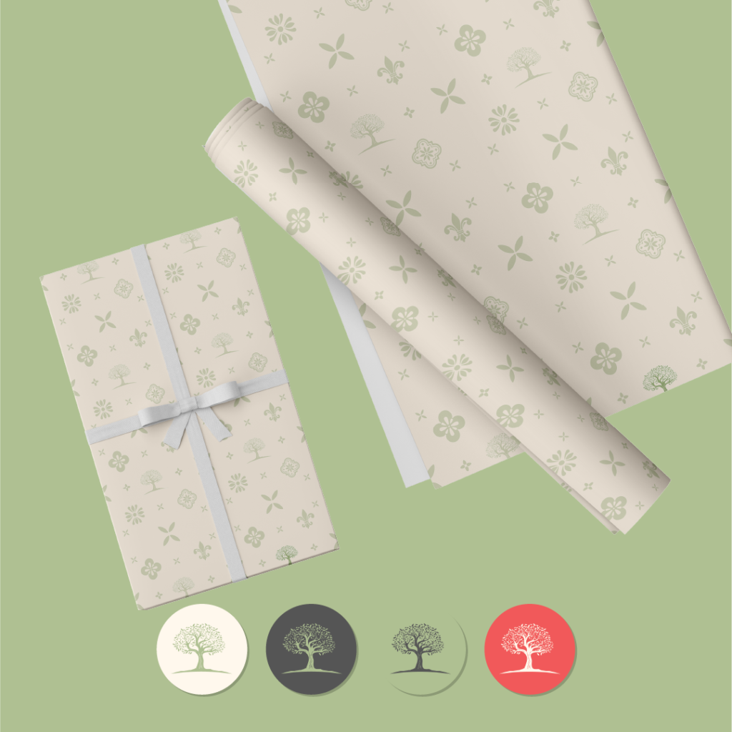
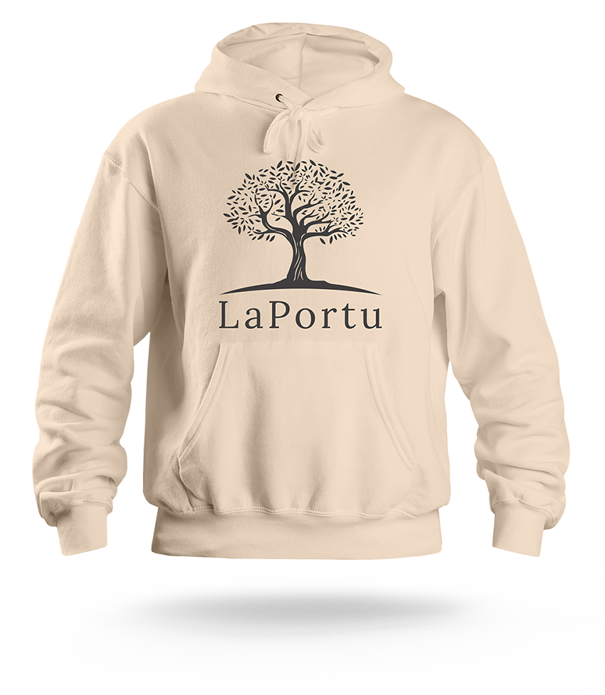
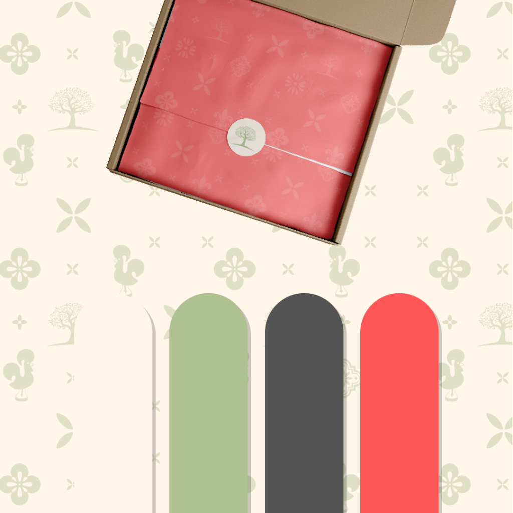
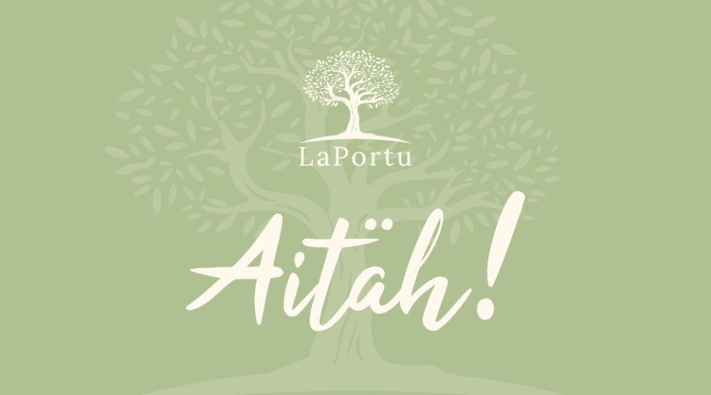
The client requested just a logo, but I offered the whole package; a logo, color palette, suitable fonts, along with visual samples.
The entire visual was meant to remain rather modest, with soft colors and images that would characterize elements typical of Portugal. Since LaPortu does not only import cooking oils, it wasn’t possible to use just the olive element, so a symbolic image of a tree was chosen instead.
Thank you LaPortu for trusting me in this process!

MudEST

MudEST: Brand visual identity design

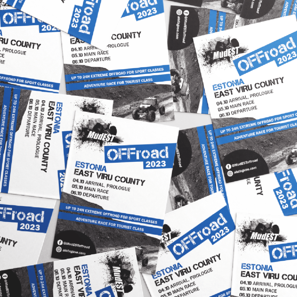
MudEst is an Estonian off-road motorsport club that organizes off-road competitions and promotes the development of the sport.
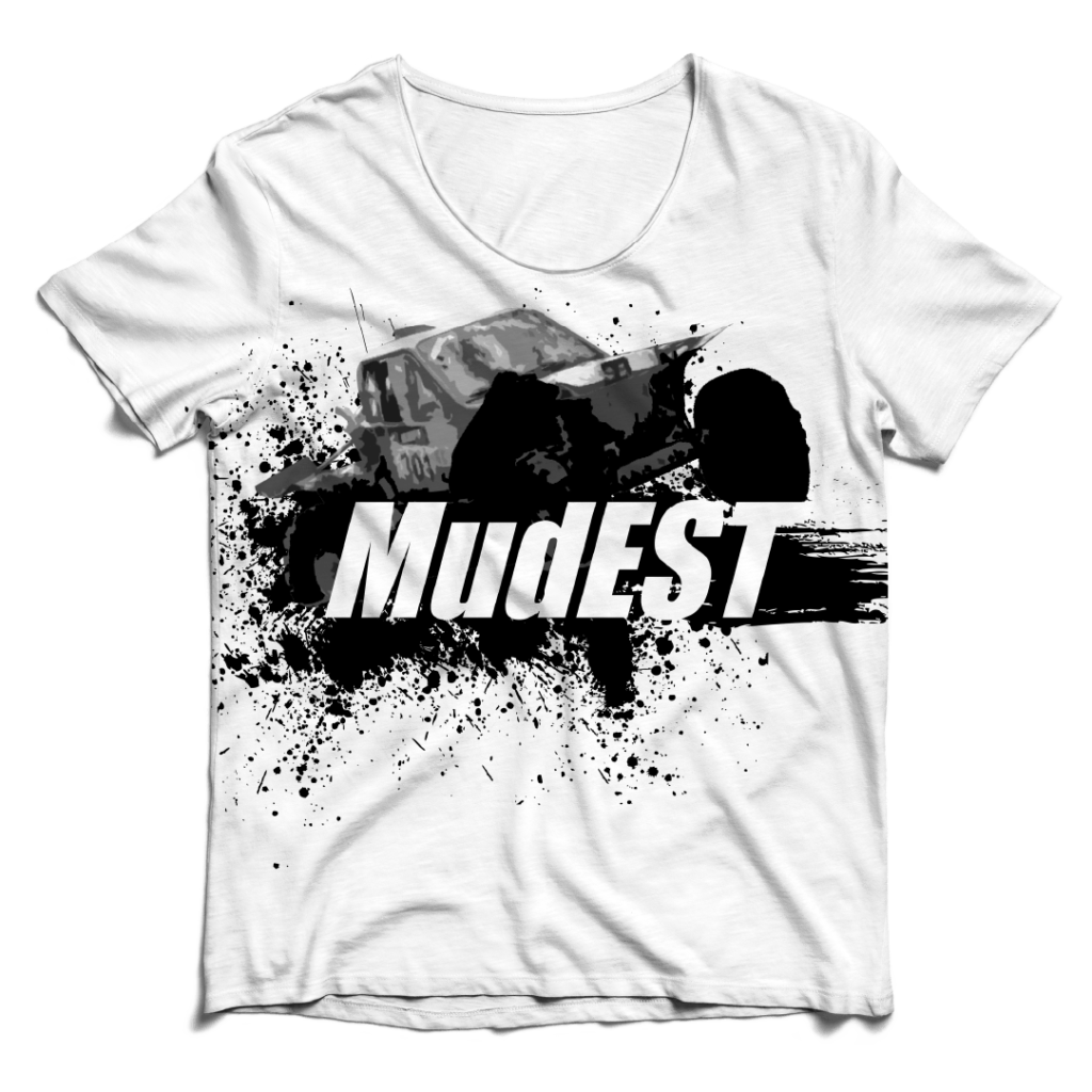
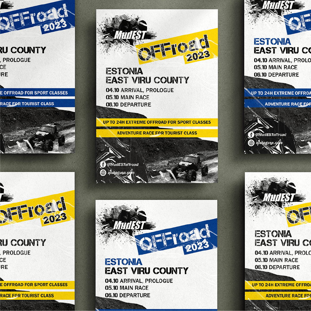
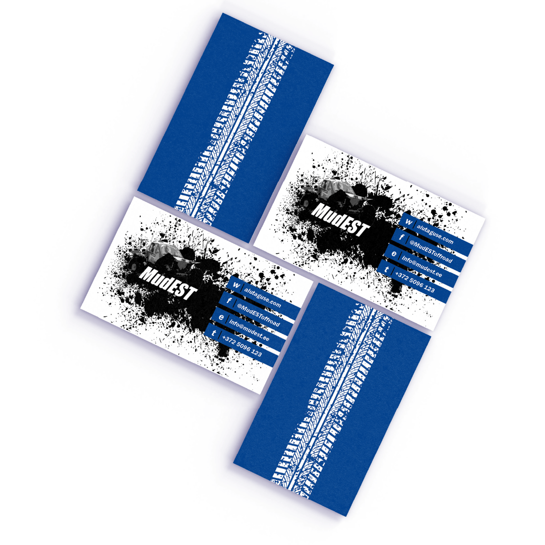
I designed a bold visual identity for MudEst that reflects their passion for motorsports.

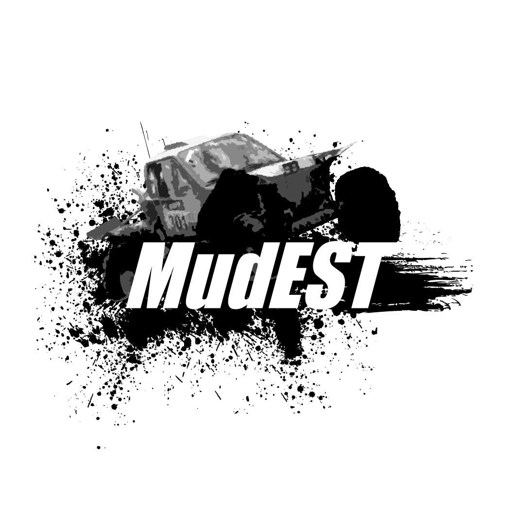
The logo design features splattering mud along with an image of a racing car and a bold font to emphasize the club's connection to adrenaline-filled off-road competitions.
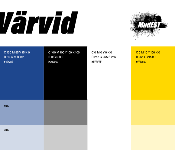
The colors were chosen to be bright and strong, reflecting an Estonian character
(mainly used color scheme is blue, black, and white), but I also presented an alternative version in yellow and black
option.

Puu Teenused

PUU teenused (Tree surgeon services): Brand visual identity design

PUU Teenused specializes in tree and brush cutting, hedge trimming and other similar services.
The client's request was to have a logo that is simple and clean, but at the same time reflects their
commitment to professional work.

I designed a logo that combines a recognizable element with simplicity, using a minimalist and modern style.
I selected a color palette that includes a nature-inspired green as the main color, along with a text color and an accent tone.
I used clear and readable fonts that reflect the company's professionalism and simplicity.
I also created several visual samples to demonstrate the cohesive and professional appearance of the brand's visual identity.

en_US